Building a design system for Historic Environment Scotland’s digital archive
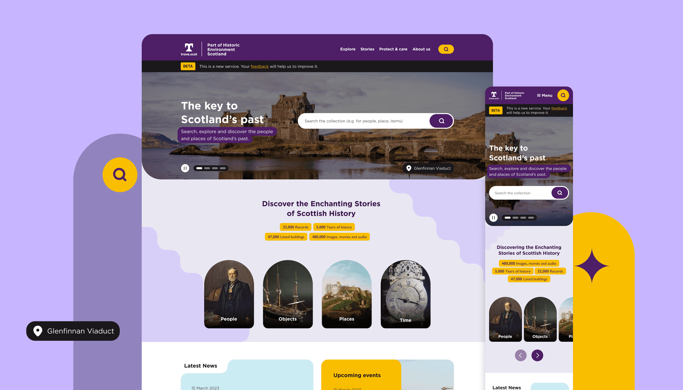
The aim was to establish a digital repository framework that encompasses photos, sketches, maps, and scripts – in addition to the correlations among locations and Scotland's historical personalities and occurrences, fused with arts, literature, vernacular, and culture.
HES want these to be shared understood and enjoyed with pride by everyone.
Edinburgh, Scotland
Public
2015
About HES
Historic Environment Scotland is a public body that manages and preserves Scotland’s historic sites such as castles, abbeys, and monuments, and oversee the preservation of the nation’s built heritage.
The Challenge
Designing a system for Historic Environment Scotland’s digital archives ( named Trove) means walking on a tightrope between history and usability.
We've got centuries old artefacts, photos, and map -all unique, valuable, and each deserving respect. Then there’s our people: researchers, casual browsers, teachers and anyone with accessibility needs.
It’s like trying to make a museum everyone can walk through, touch, and understand, but online. We needed a set of rules that can handle an 18th-century maps, video interviews from the ’70s, and stacks of old manuscripts. The challenge was to build a platform that is flexible but consistent, modern but true to history. Every pixel, every decision needs to respect the past and work seamlessly in the present.
Design process adopted for the beta phase
Process
1. Defining purpose: We started by reconsidering the need for a design system in this scenario. Identified the problems this solution might help resolve for both the internal team and their end users. One of the main aspect a design system could address was replicability. As this was a complex platform we needed to create a variety of user journeys and test them rigorously before making rapid improvements for the beta phase. With this approach we build a design library that would give the team's internal designers and developers the flexibility to refine the platform efficiently in the future.
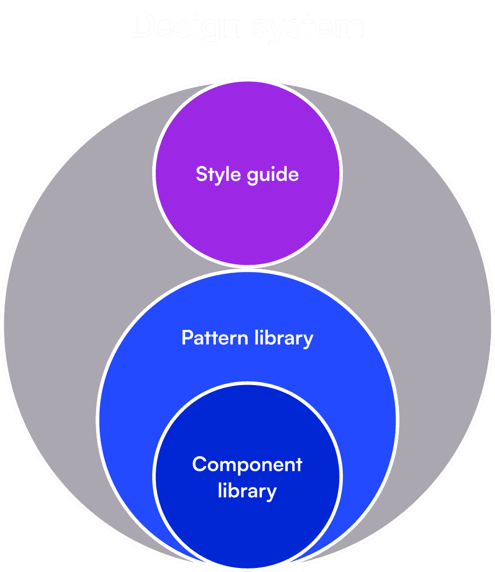
Design systems and style guides both capture certain guidelines, principles, and visuals for creating interfaces or other designs within a company, product, or service. The design system is the “parent” — it contains different smaller pieces, including style guides. Style guides, pattern libraries, and component libraries are the “children” that collectively make up a larger design system.
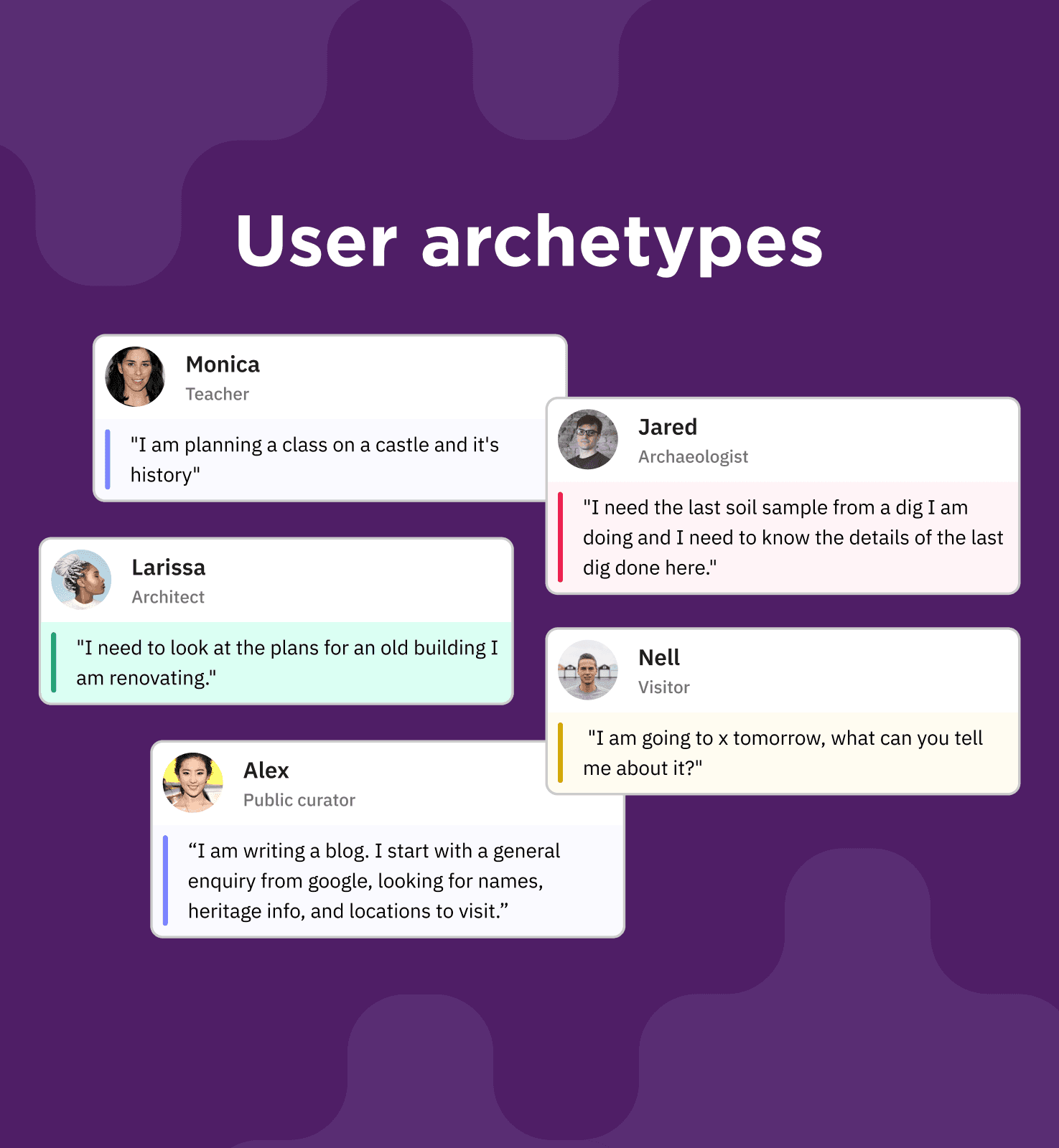
User archetypes and there verbatim
Screen-shoots of user journeys and information architecture
2. Scoping and auditing: We gathered all the wireframes and analyzed all content & components that we might need to build in this phase. Then we audited existing wireframes to identify inconsistencies or gaps that the design system needed to address. This helped us to see what can be reused and where standardization was needed. After this we started to establish a set of design assets—visual styles, components, documentation, and content.
List of components based on alpha phase wireframes
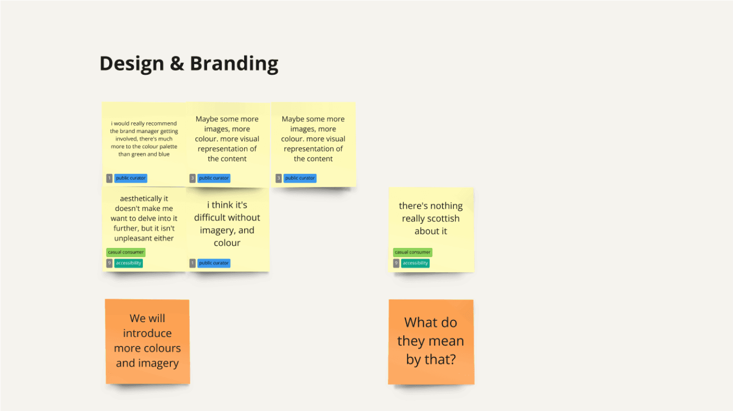
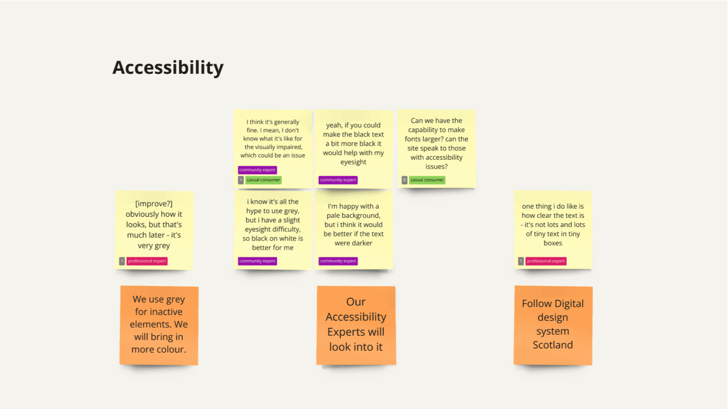
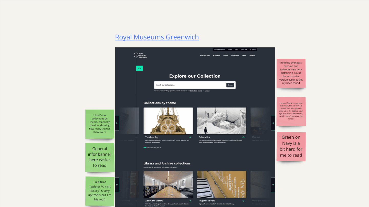
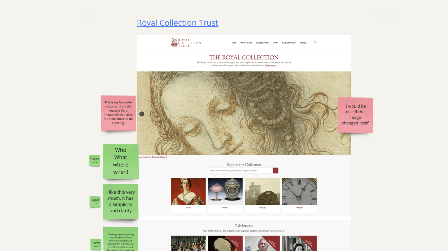
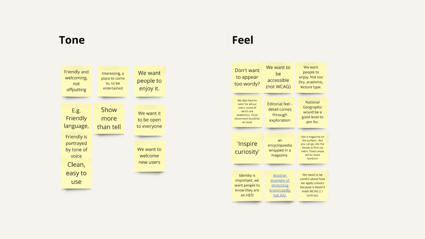
3. Stakeholders involvement: In this phase, we collaborate with designers, developers, product owners, and other stakeholders to collect their input. This helped in refining and validating our assumptions on the standards and components that were required.
Screenshots from stakeholder workshop focused on visual design
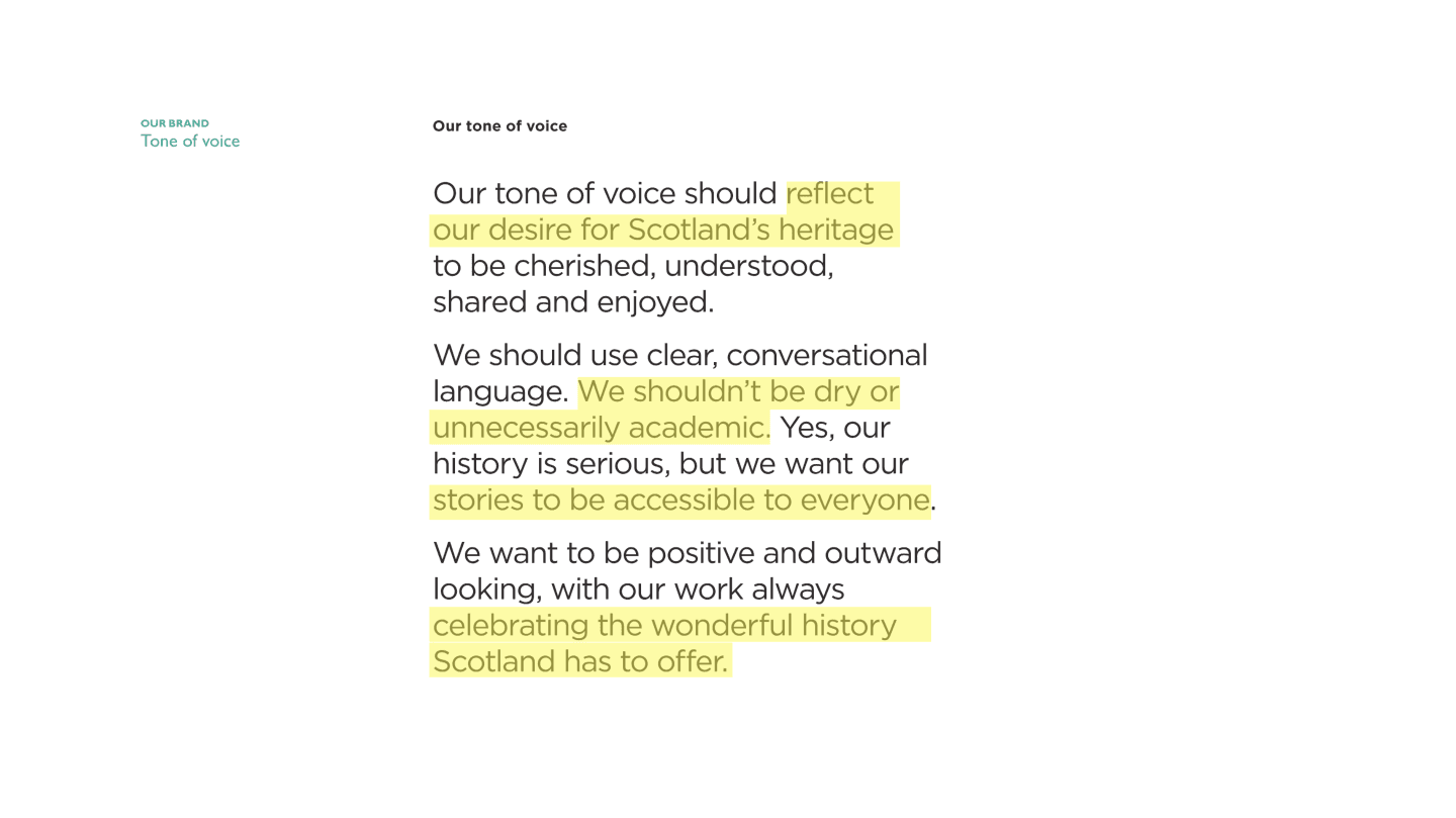
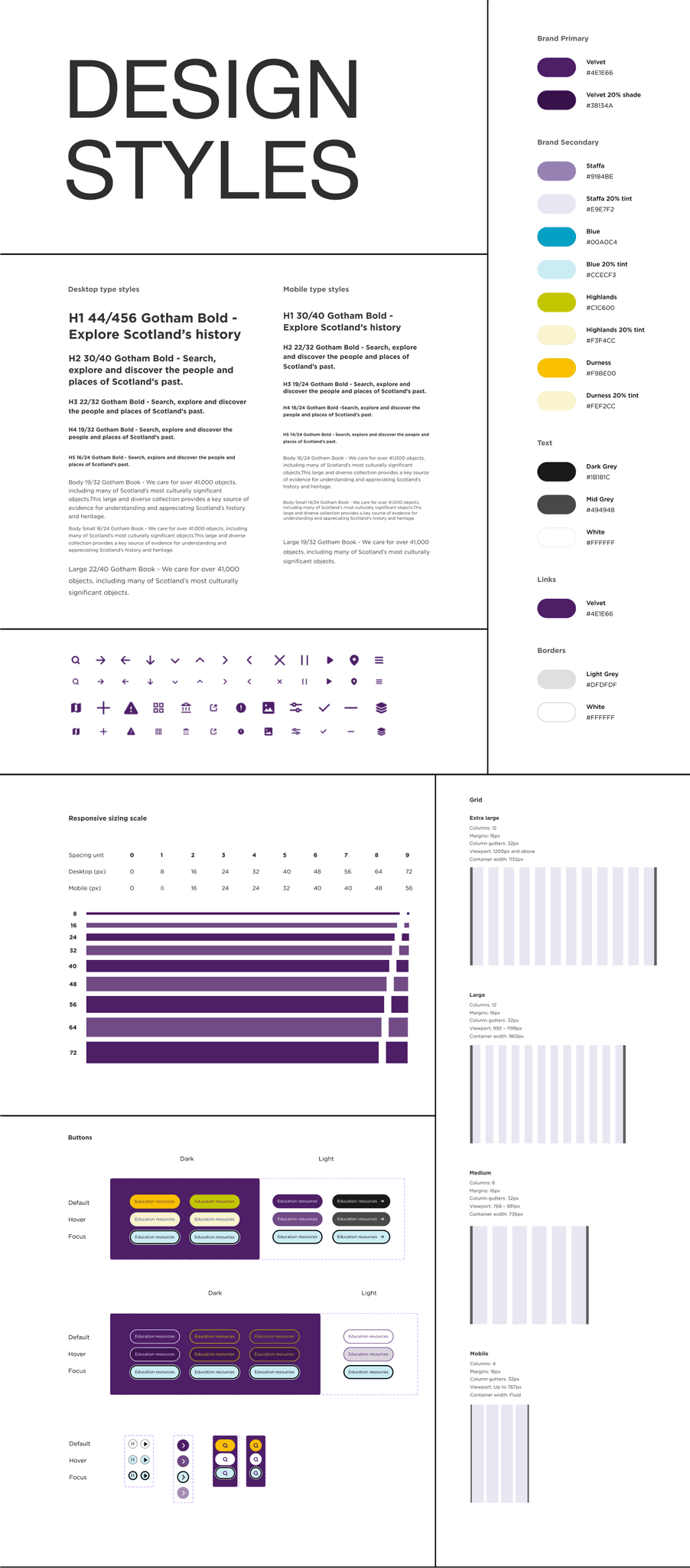
4. Defining foundations: Here we focused on setting the core design principles, including color palettes, typography, spacing, iconography, and tone of voice. This helped us form the visual and content foundation for every component, ensuring brand consistency across the platform.
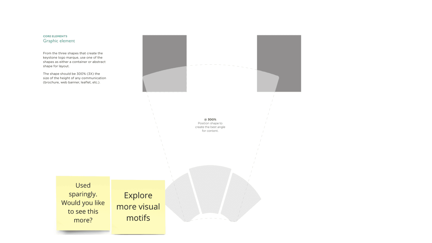
Inspiration for UI elements based on visual elements from branding guidelines
Design system styles created in Figma
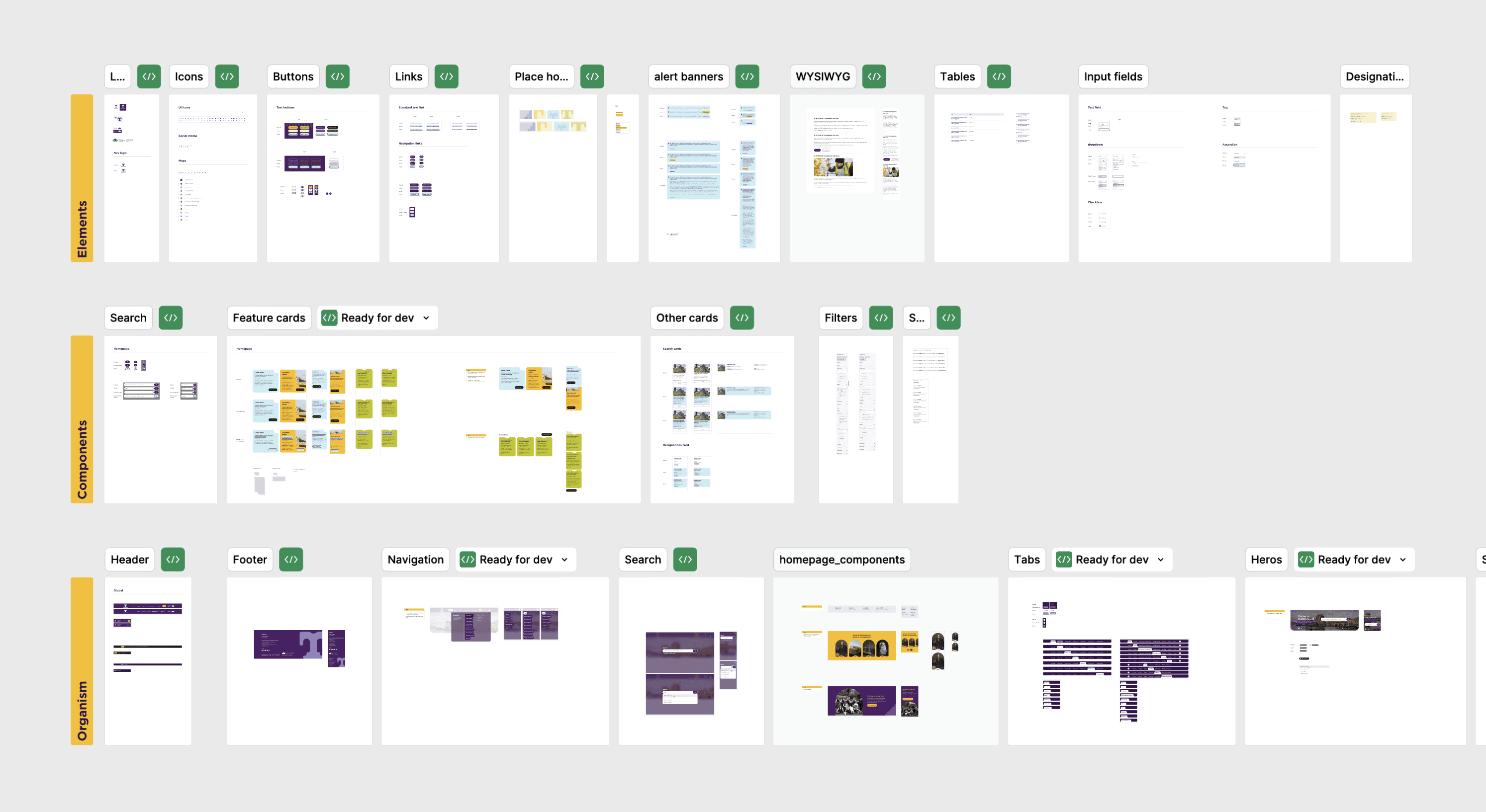
5. Creating components & patterns: From our collected insights we designed reusable UI components like buttons, form fields, cards etc. For future reference, we also documented the components with guidelines on when and how to use them. We grouped them into patterns, such as headers or search forms, to address common use cases and page structures.
Elements, components and organism created for Trove design system
6. Document usage guidelines (WIP for next release): Since the project is currently in beta phase, we need to be prepared for its next release. For future steps, we will be developing clear documentation explaining how to use each component, pattern, and visual element. The guidelines will also include code snippets, examples of good and bad usage, and any specific guidelines for edge cases.
Results
We successfully created a unified design language - 'Trove design system' is now an ever evolving entity.
This design library will help Trove's in-house designers and developers to replicate the designs efficiently by utilizing premade UI components and elements. We used atomic design framework to make sure it is modular and flexible. The service will be internally launched as a beta platform and will further move into rigorous testing for refining the user journeys and usability.
One of our main success metrics was to get the approval from Digital Service Standard Scotland (DSSS). This approval validated and ensured that this new public digital service designs are user-focused, accessible, consistent, and secure, promoting high-quality and inclusive experience.
“Innovative and beautiful work, and a very happy client indeed. ”

Mark Henley
Digital Transformation Director | TPXimpact
