Redesigning a news portal for Cancer Research UK
The redesign of the Cancer News Portal demonstrates how a user-centered, accessible design approach can effectively transform a platform.
London, UK
2002
Charity
Challenge
Cancer Research UK’s news platform is a key hub for sharing critical updates on research, public health initiatives, and patient stories. It targets diverse audiences—researchers, patients, and donors—each with specific needs. The site required an overhaul to offer a streamlined, accessible, and engaging experience that aligns with CRUK’s mission.
Objective
Transform the platform into an intuitive and accessible user experience while enhancing visibility through SEO improvements and aligning with brand values.
Challenges Identified
Diverse User Base: Users have varied objectives; researchers need in-depth scientific updates, while families affected by cancer seek supportive content. The site needed to serve these audiences efficiently without overwhelming them.
Accessibility Gaps: The platform lacked compliance with WCAG standards, creating barriers for users with disabilities. Color contrasts, navigational structure, and text scaling needed improvement.
Complex Navigation: Analysis (Hotjar, usability tests) revealed that users struggled to find relevant content due to disorganized navigation and lack of sub-navigation options. Most users were “scrolling endlessly” without finding what they needed.
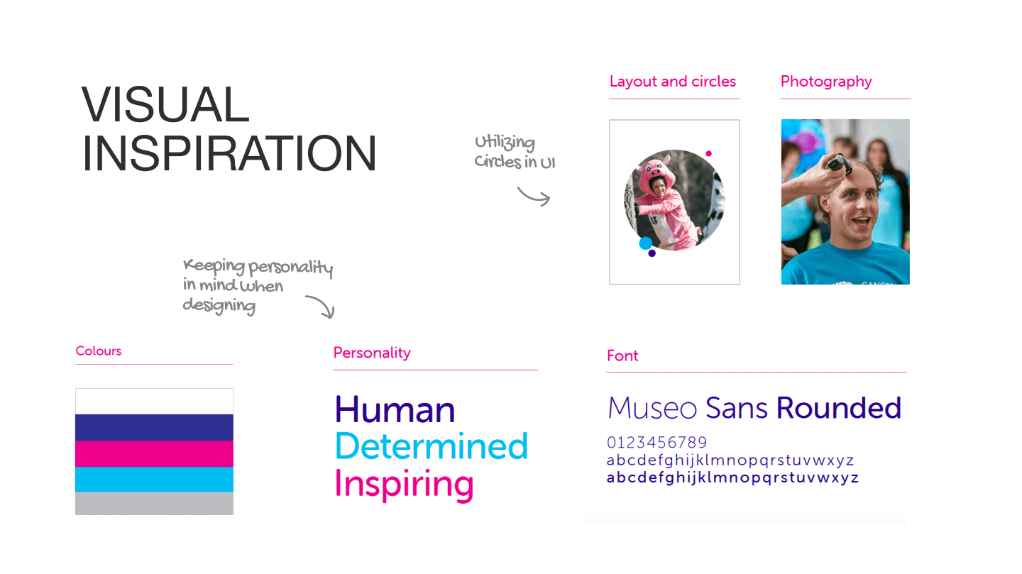
Visual design and interaction: The current new site looks very clinical, there is an opportunity to make it look interesting and engaging.
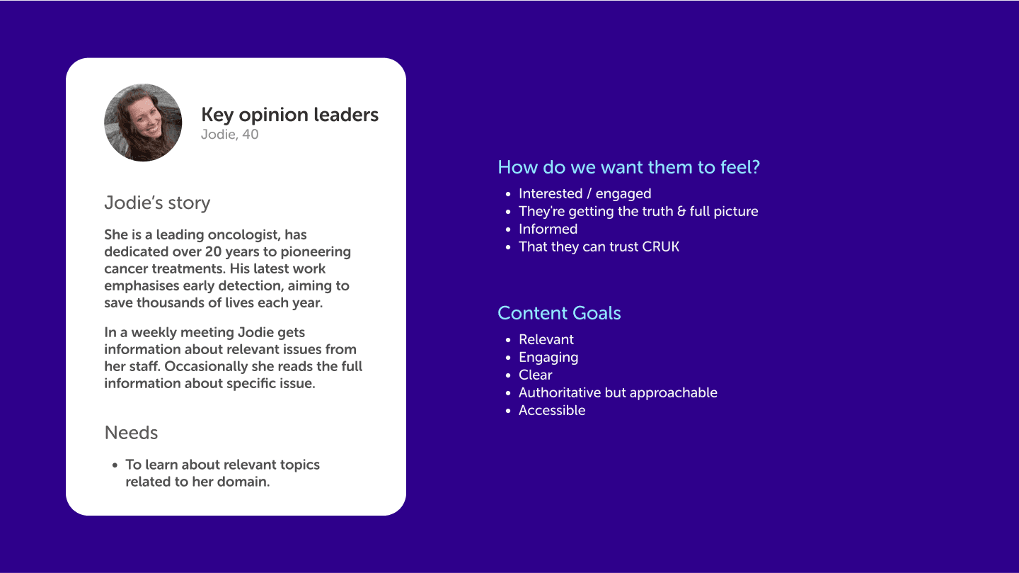
User personas
User-Centered Research and Strategy
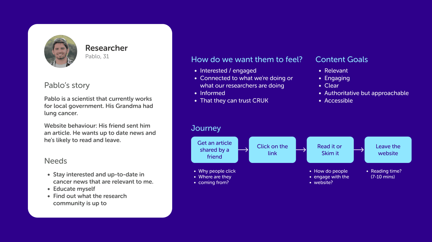
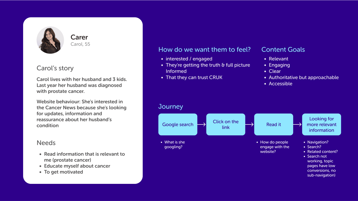
Persona Development: To tailor the experience, we developed detailed personas such as “Carol,” a family member affected by cancer, and “Pablo,” a researcher. This ensured that the site met specific needs, like easy access to personalized content for families and scientific updates for professionals.
Accessibility Audits: Conducted a comprehensive audit to align with WCAG 2.1 standards. Improvements included optimized color contrast for readability, larger text sizes, and enhancing keyboard navigation for seamless use.
User Testing and Workshop: Organized interactive workshops and usability tests where real users interacted with prototypes. Feedback revealed key areas for improvement, leading to refined navigation structures and enhanced search functionality.
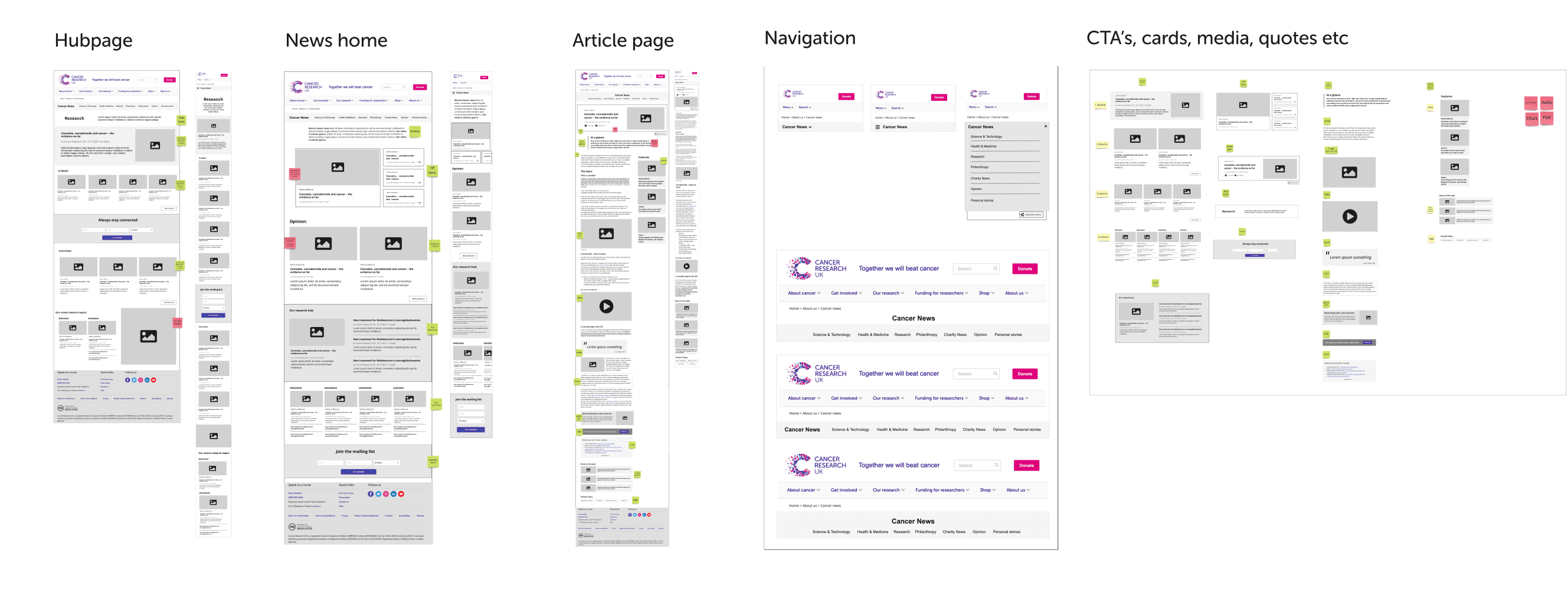
Wireframes
Design System and Innovative Solutions
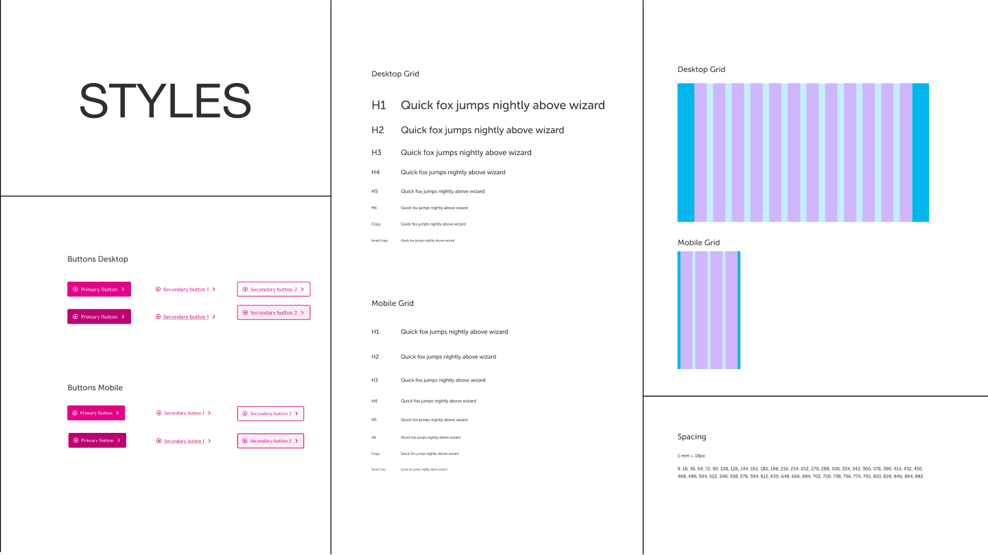
Comprehensive Design System: Developed a design system encompassing accessible color palettes, typography styles, button components, and responsive grid layouts for mobile and desktop. This system unified the user experience, ensuring consistency across pages while prioritizing inclusivity.
Sub-Navigation & News Filtering: We introduced an intuitive sub-navigation system allowing users to filter news by categories like “Health & Medicine,” “Science & Technology,” and “Personal Stories.” This simplified finding relevant information and increased user engagement by 20% post-launch.
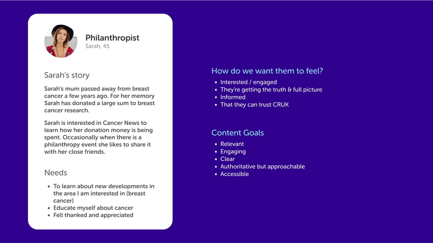
Highlighting Content for Target Audiences: Specific sections were tailored for critical user groups, such as “For Researchers” and “For Philanthropists.” Highlighting these ensured these users could access focused information effortlessly.
User personas
Implementation and Iteration
Prototyping and Testing: Prototypes were developed and tested with users in iterative cycles. Key insights led to refinements in layout, user journeys, and search capabilities. For instance, changes in the search bar placement increased search usage by 15%.
SEO and Performance Optimization: Collaborated with the development team to meet Google Core Web Vitals, optimizing page load speeds and improving SEO, ensuring a smooth user experience and higher visibility.
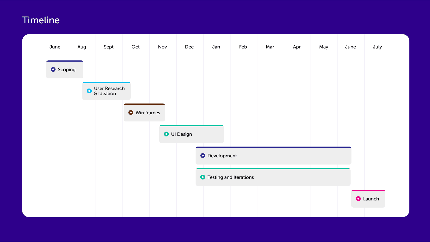
Timeline
Results and Impact
Increased Engagement: Post-launch data revealed a significant 20% increase in click-through rates from the landing page. Users spent an average of 25% more time exploring content due to the improved navigation and relevant content sections.
Accessibility Achievements: The site now complies with WCAG 2.1 AA standards, ensuring accessibility for users with visual and motor impairments. This compliance not only expanded the user base but also built trust with CRUK’s audience.
Positive Feedback Across Personas: Feedback was overwhelmingly positive, particularly from researchers and families who noted the site’s improved ease of use and relevant content access.
Walkthrough of the news portal prototype
Conclusion
The redesign of the Cancer News Portal demonstrates how a user-centered, accessible design approach can effectively transform a platform. By focusing on real user needs, building an inclusive design system, and prioritizing accessibility, we created a cohesive, engaging experience that aligns with CRUK’s mission.
